Logos (Various)
My approach to logo design is similar to UX design. Not only should the logo represent the product or service, the logo should also represent the owner(s) spirit leaving a lasting impression on their customers.

Godin Law
A law firm dealing with wills & trusts, scuba, accidents, etc.
The logo design reflects a high standard of practice and professionalism while incorporating the primary lawyer's favorite color, orange.

Squidink
A concept beer flavoring mix no longer in production. Beer + Mix = Flavor
The logo design plays on a squid's inking abilities to change the color of the water masking the squid's escape. In this case, the ink, represents one of five flavor packets, that changes any beer to be that flavor powder when poured. The six flavors were: mojito, margarita, berry cosmopolitan, piña colada, lemonade and root beer.
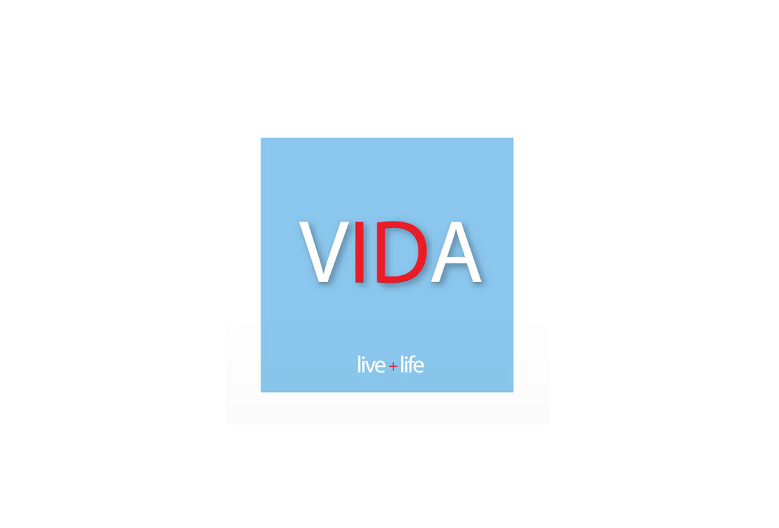
Vida ID
An Interior Design firm specializing in commercial real estate that no longer operates.
The logo keeps structure at the forefront with the san-serif, tall, lean font inside a think building block light-colored container. The lead interior designer loves warm on top of cool colors.

Bleu Artichoke
A concept lunch and dinner cafe no longer opened.
The cafe owners wanted a logo fit for a vertical sign that was playful, elegant and inviting while not directly playing up to its name.

Stonehouse
An IT technology firm no longer in operation.
The logo design is a modernized update from it's previous logo design keeping the graphical 'S' shape but minimizing the amount of "S" from seven, to three, representing their three core services: device, network, storage.

Nice Underwear
A concept men's underwear brand reflecting the positive feeling of wearing fun, lightweight, colorful underwear.
The logo design reflects a playful feeling invoked by the brand's name. To be nice is to be happy and playful. The tongue in the "C" represents a joyful, flirtatious message from the wearer. Green is one of the brands colors. The other colors are blue and yellow. These three colors represent a sunshiny happy day.

Mangisi
A concept men's underwear brand no longer in production.
The logo is a play on the owner's childhood nickname. The above average tag-style tagline represents men who live above average lives in every way possible. The tagline was stitched in the center of each waistband. The all lowercase decision keeps the logo looking mature yet youthful.

Havel Camera
A high-end camera repair service shop still in operation.
The circular logo mark design reflects a camera shutter lens half in progress while the playful font beneath it acts as a camera lens housing body.

Greenkeepers
A lawn and landscaping company no longer operating.
The logo design reflects the end result of the company's main service, which is ultimately lawn beautification.

Essilor
An optometry company specializing in corrective lens with AR (antireflective) technology.
The logo design displays a lens in the place of the "O" in the shape of a pupil. The san-serif font and the script-like tag line gives the logo a modern retail appearance.
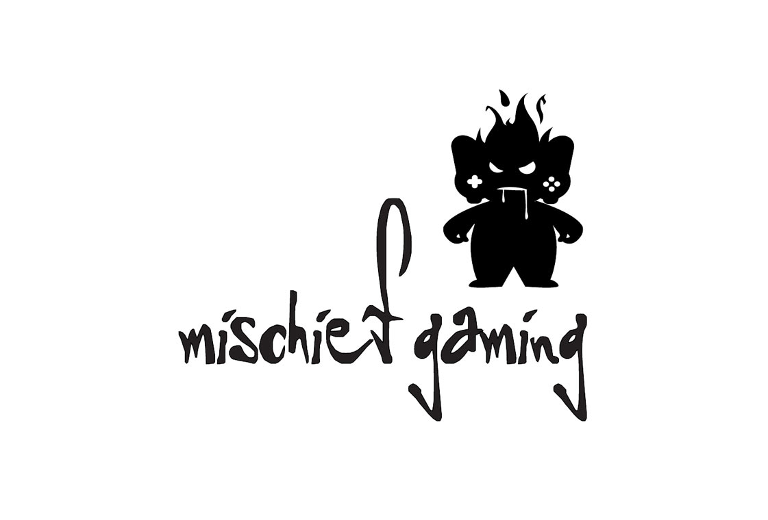
Mischief gaming
A gamer who, at the time of existence, ate the competition alive in role-playing and adventure game play.
The logo design reflects the "ate the competition alive" in a palatable way by eating a wireless controller. Because of this, the mid-sized person silhouette shape takes on a vicious, hungry, beast-like appearance. The lowercase font and decision to elongate the ascenders and descenders provides a slight sense of playfulnes.